47 Best Heatmap Software in 2024
We’ve all been there – drowning in endless rows and columns of numbers, struggling to find insights or trends.
But what if I told you there’s a game-changing tool to help you visualize and analyze data more effectively? Enter heatmap software!
These fantastic tools transform massive amounts of data into easily digestible, visually stunning heatmaps that help you identify patterns and correlations in a snap. Are you ready to learn about some of the best heatmap software available today? Let’s go!
Top Heatmap Tools
Do you have a heatmap tool?
Methodology
The ranking of the heatmap software is determined by considering several factors, including the number of citations and user reviews they have received.
Most Used Heatmap Software
1.
Mouseflow is a powerful heatmap software that allows you to visualize and analyze user behavior on your website. With its easy-to-use interface and robust features, it helps you uncover valuable insights that can improve your website’s performance. Key benefits include:
- Real-time heatmaps: Instantly see where users click, scroll, and move their mouse, helping you identify high-engagement areas and potential pain points.
- Session recordings: Replay user interactions to gain a deeper understanding of their browsing experience and identify areas for improvement.
- Funnel analysis: Track user behavior across multiple pages and spot drop-offs, enabling you to optimize conversion funnels effectively.
- Form analytics: Analyze form interactions to pinpoint issues and enhance overall user experience.
Pricing: Free/Paid
Pricing page: https://mouseflow.com/pricing/
2.
VWO (Visual Website Optimizer) is a comprehensive heatmap software that provides valuable insights into user behavior on your website. Designed to enhance user experience and increase conversions, it offers a range of features that help you understand and optimize your site. Key benefits include:
- Click and scroll heatmaps: Visualize user clicks and scrolling patterns, making identifying high-engagement areas and uncovering optimization opportunities easy.
- A/B testing: Compare website versions to determine the most effective design or content, increasing conversions.
- Session recordings: Replay user interactions to better understand their browsing experience, pinpointing potential pain points.
- Multivariate testing: Test multiple website elements to identify the optimal combination for driving conversions.
Pricing: Paid
Pricing page: https://vwo.com/pricing/
3.
Plerdy is a versatile heatmap software designed to help you understand user behavior on your website and optimize it for better performance. Offering a suite of features that cater to various needs, it enables data-driven decision-making to improve user experience. Key benefits include:
- Click heatmaps: Visualize user clicks on various website elements, helping you identify high-engagement areas and uncover optimization opportunities.
- Scroll heatmaps: Analyze scrolling patterns to determine the most engaging content and reveal areas that need improvement.
- SEO-checker: Monitor your website’s SEO performance and receive actionable insights to enhance search rankings.
- Event tracking: Track and measure custom events to understand user interactions better and make data-driven optimizations.
Pricing: Free/Paid
Pricing page: https://www.plerdy.com/pricing/
4.
Hotjar is a popular heatmap software that helps you understand user behavior on your website and uncover opportunities for optimization. Combining various features in a user-friendly interface, it provides valuable insights to improve user experience and boost conversions. Key benefits include:
- Click and scroll heatmaps: Visualize user interactions, such as clicks and scrolling patterns, to identify high-engagement areas and uncover areas for improvement.
- Session recordings: Replay user activity on your website to better understand their browsing experience and identify potential pain points.
- Conversion funnel analysis: Analyze user behavior across multiple pages to detect drop-offs and optimize conversion funnels effectively.
- Feedback tools: Gather direct user feedback through surveys and polls to gain insights into their preferences and expectations.
Pricing: Free/Paid
Pricing page: https://www.hotjar.com/pricing/
5.
Clicky is a powerful heatmap software that offers real-time analytics to help you understand user behavior on your website and optimize it for better performance. With its easy-to-use features, it provides essential insights to drive data-driven improvements. Key benefits include:
- Real-time heatmaps: Visualize user clicks and interactions instantly, enabling you to identify high-engagement areas and uncover optimization opportunities.
- Individual visitor tracking: Gain detailed information on each visitor’s behavior and activity on your website, providing a personalized view of user experience.
- Goal tracking: Set specific goals and monitor your website’s progress towards achieving them, allowing you to optimize your strategies for better results.
- Uptime monitoring: Receive alerts when your website experiences downtime, ensuring you can quickly address any issues to maintain optimal performance.
Pricing: Free/Paid
Pricing page: https://clicky.com/help/pricing
6.
Lucky Orange is a comprehensive heatmap software that helps you analyze user behavior on your website, allowing you to optimize it for better performance and increased conversions. Packed with user-friendly features, it provides essential insights for data-driven improvements. Key benefits include:
- Dynamic heatmaps: Visualize user clicks, movements, and scrolling patterns to identify high-engagement areas and uncover optimization opportunities.
- Session recordings: Replay individual user interactions on your website to better understand their browsing experience and pinpoint potential pain points.
- Conversion funnel analysis: Analyze user behavior across multiple pages to detect drop-offs, helping you to optimize conversion funnels more effectively.
- Real-time chat support: Engage with visitors directly to assist, gather feedback, or answer questions, boosting user satisfaction and increasing conversions.
Pricing: Free/Paid
Pricing page: https://www.luckyorange.com/pricing
7.
Crazy Egg is a user-friendly heatmap software that helps you understand visitor behavior on your website, allowing you to optimize it for better performance and increased conversions. Boasting a range of powerful features, it provides essential insights for data-driven improvements. Key benefits include:
- Various heatmap types: Visualize user clicks, scrolling patterns, and mouse movements to identify high-engagement areas and uncover optimization opportunities.
- A/B testing: Compare website versions or elements to determine the most effective design, layout, or content for improved conversions.
- Snapshot reports: Capture detailed reports of visitor interactions on your website, providing invaluable insights into user experience and browsing behavior.
- Easy integration: Seamlessly integrate Crazy Egg with popular website platforms and marketing tools, streamlining your analytics workflow.
Pricing: Paid
Pricing page: https://www.crazyegg.com/pricing
Further reading
What Is Heatmap Tracking?
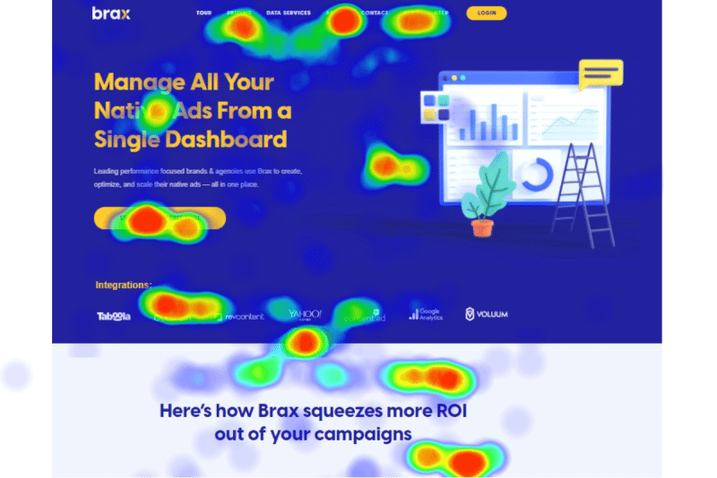
Heatmap is a type of data analysis that will assist you in understanding how users interact with your website. Colors represent values rather than numbers, making it easier to grasp and analyze more complicated data sets.
What Does a Heatmap Show?
Heatmaps highlight which sections of your page are most popular with visitors. You may use a heatmap to examine how users click, scroll, and move their mouse on your page, depending on the heatmap you produce.
For example, click heatmaps reveal where users click, which is helpful for several reasons.
Most clicked elements: The elements on your page with the highest rate of user clicks can tell you where people are spending the majority of their time.
Dead Links: Dead clicks occur when users click on non-clickable components.
How Does a Heatmap Work?
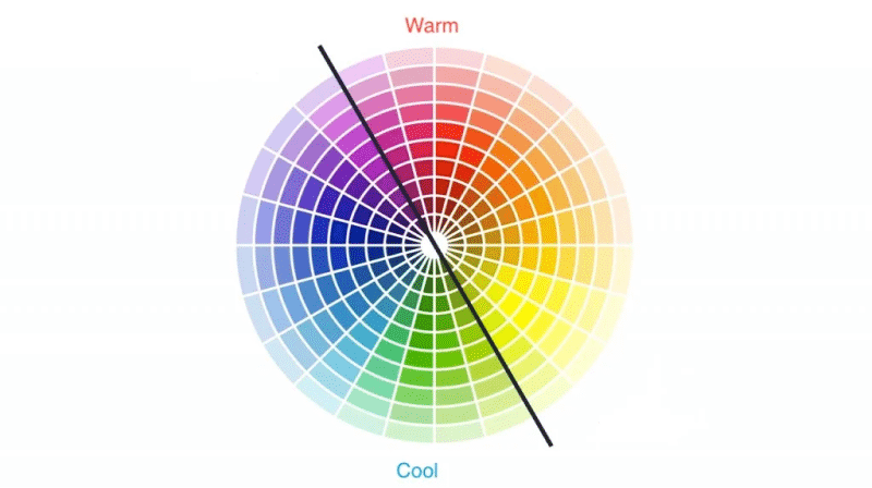
Heatmaps use a color scale to show you exactly how people interact with your site. Popular sections of your site, known as hotspots, will be highlighted in vibrant colors such as reds and oranges. Less popular sections of the website will be shown in cold colors such as blues and greens.
How Do I Create a Heatmap of My Webpages?
To build one, you’ll need a heatmap software application like the ones listed below. You must select the activities you want to analyze (scrolling, clicking, mouse movement) and the web pages you want to generate a map.
What Are the Different Types of Website Heatmaps?
The most common types of website heatmap analysis are as follows:
- Mouseflow heatmap: Mouseflow heatmaps track where the user’s cursor moves on your website throughout a session.
- Clickmap: A clickmap can combine data from several users’ clicks and display the findings in a colorful heatmap, with the warmer colors representing the elements that were most often clicked on.
- Click percentage map: Click percentage maps are a website heatmap incredibly effective for measuring your users’ activity. These heatmaps show the click results as percentages across the elements on the website where people clicked the most.
- Scrollmaps: Scrollmaps employ a warm-to-cold color pattern comparable to mouseflow heatmaps and clickmaps. Scrollmaps, on the other hand, display the colors in horizontal lines across the screen, generally beginning with red from the top, because it is generally the most viewed portion of web pages. The horizontal hues get more relaxed as you scroll down the screen and below the fold.
- Confetti map: Confetti maps are unique in that they display more than simply the density of clicks. Instead, they present it like it is: how many users clicked and where they clicked. Consequently, you can see all the mouse clicks on the website as dots.
How Can Click Heatmap Improve Conversions for Your Site?
Understanding user behavior is key to improving your website’s conversions, and click heatmaps are an excellent tool to determine how people interact with your website.
Here are some ways click heatmaps can help you increase your conversion rate:
- If a click heatmap shows that an unclickable element receives too many clicks, users think it’s clickable. Eliminate this confusion to make significant elements more attention-grabbing.
- CTAs significantly impact your conversion rate, and heatmaps show whether visitors interact with your CTAs effectively or not.
- With heatmaps, you can detect popular areas of your website to put more important elements in these areas.
- Click heatmaps enable you to identify the elements that don’t get much attention. You can replace these elements with more important content.
Wrap Up
With the right heatmap software in your toolkit, you’ll no longer need to stare at overwhelming spreadsheets, scratching your head in confusion.
Instead, you’ll be able to uncover hidden patterns, identify crucial insights, and make data-driven decisions like never before.
So, whether you’re a marketing whiz or a data scientist in the making, these heatmap tools will undoubtedly help you unlock the full potential of your data.
Time to level up your analysis game and make those numbers work for you!
FAQs
Heatmap software is a tool that visually represents data through a color-coded matrix, allowing users to quickly understand complex data sets and identify patterns, trends, or anomalies. It is commonly used for data analysis, web analytics, user behavior tracking, and scientific research.
The best heatmap software should offer customizable color schemes, interactivity, data filters, multiple data import options, real-time updates, compatibility with various platforms, and ease of use.
Many heatmap software tools are designed explicitly for website analytics, allowing you to track user behavior, such as clicks, scroll depth, and mouse movement, to optimize the website design and user experience.
Some popular heatmap software options include Plotly, Seaborn, Heatmap.me, and Crazy Egg. Each tool has its unique features, so it is essential to research and choose the one that best fits your needs.
Heatmap software costs vary depending on the features offered, the number of users, and the type of data being analyzed. Many tools offer a free trial, while others provide free or open-source versions with limited features. Some also offer tiered pricing plans based on usage and requirements.
The ease of integration will depend on your chosen heatmap software and current systems. Many heatmap tools provide APIs, plugins, or direct integration with popular data visualization or website analytics platforms, making implementing them in your existing setup easier.
Yes, most heatmap software tools offer options to export your visualizations as image files, embed them into webpages, or share them through cloud-based platforms or interactive dashboards.
The ability to handle large datasets will depend on the specific heatmap software and its capacity. High-performance tools with efficient rendering and optimized data processing capabilities are better suited for large datasets. It’s essential to assess the scalability and performance of the software before committing.
Many heatmap software tools are designed with user-friendly interfaces and easy-to-understand features, making them suitable for beginners. Some tools also provide tutorials, examples, and community support to help users get started. However, the learning curve may vary depending on the software and the user’s familiarity with data visualization concepts.
Yes, there are several alternatives to heatmaps for visualizing data, such as bar charts, line charts, pie charts, scatter plots, and bubble charts. The choice of visualization technique depends on the nature of the data, the relationships you want to explore, and your specific goals.